Hello Dahlings!
I am so excited to share with you the colors Pantone has chosen for Spring 2014! With New York Fashion Week coming to an end, designers have presented their collections for the upcoming Spring season and await the consumer’s reaction. This year the colors are richer and brighter than ever which should make for some fabulous fashion in the coming months.

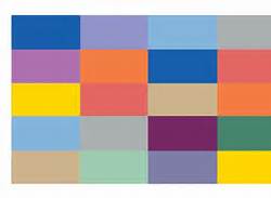
- Pantone 2014 Spring Color Chart
Here’s what Leatrice Eiseman, Executive Director at Pantone Color Institute had to say as she introduced this Spring’s Colors:
“Three very adaptable pastels sit on one end of the palette, and, because we are so accustomed to seeing them as nature’s background, they can be creatively combined with any other color in the spectrum. Placid Blue, like a picture-perfect, tranquil and reassuring sky, induces a sense of peaceful calmness, while Violet Tulip, a romantic, vintage purple, evokes wistful nostalgia. Similar to the verdant shade of springtime foliage, Hemlock, a summery, ornamental green, provides a decorative touch that’s very different from the greens of recent seasons. Pair any of these versatile pastels with a bolder hue for an au courant look.
Sand, a lightly toasted and amiable neutral, conjures images of the beach and the carefree days of summer. Try pairing Sand with Hemlock for perfect, natural balance. Paloma serves as a quintessential neutral, interesting enough to be worn alone or combined with any color for sophisticated poise.
Cayenne, a high-pitched red, adds a dash of spicy heat to neutrals, and heightens the excitement when mixed with Freesia, a blazing yellow that is sure to illuminate wardrobes this season. A tropical, floral-inspired shade, Freesia’s warmth and energy help set the stage for Celosia Orange, an optimistic, spontaneous hue. Pair Celosia Orange with Violet Tulip for a captivating vision, much like the setting summer sun.
The palette is brought full circle with Radiant Orchid, a bold counterpart to Violet Tulip, and Dazzling Blue,a scintillating, polar opposite to Placid Blue. Surprisingly, these strong, vibrant colors also pair well across the palette: They are perfect companions to pastels, and add confidence and vivacity when mixed with other bold colors.”
My favorite color of the season happens to be Freesia! This bright yellow hue is both fun and fabulous! I am looking forward to seeing these colors in the local retail stores and boutiques as I’m certain you are too!
Until next time Dahlings!
Happy shopping…
WJC
Photo Credit:
Pantone.com
citizenoffashion.com
